Nastaliq Dot Positioning
This week I have been working on some last-minute changes to a Nastaliq Urdu font. It’s been a very annoying week. I have not enjoyed this week. But looking back, it was worth it.
One week's work. pic.twitter.com/ZdZhkbzWwX
— Simon Cozens (@simoncozens) August 27, 2021
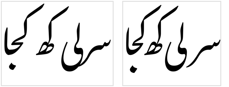
Last week we reviewed the font and found that, while it normally more-or-less worked OK, there were two areas which were not ideal: the kerning was too loose, and there were still some problems with dot positioning.
I’ve written about the kerning strategy already. The auto-kerner runs through all the final glyphs and all the initial glyphs at a range of “heights”, and tries to compute the right kerning to make the ends of words and the beginnings of words fit nicely together. But it turns out there were some bugs in the code which was doing the calculations, and this was particularly annoying because it took a long time to run, and it created a font with lots of GPOS overflows to resolve, which took a long time to build.
So much of the first part of this week was spent finding situations that weren’t working, fixing the obvious bugs, but then waiting for the font to re-build to check for any side-effects on other positioning pairs. Over and over again. While waiting for the build I tried all kinds of things to make the auto-kerner faster - I learnt a lot about Cython and compiling Python to C, and I started moving some of the underlying tools to Rust, but not enough to replace what I had - but nothing really worked. So that put me in a bad mood right from the start. In the end, though, I got something that looks much better.
Those sequences aren’t intended to make sense; they’re just testing the autokerner.
Then I spent a day writing Rust to calm myself down, before plunging into the second half of the week, which was spent dealing with dot positioning.
I started the Nastaliq project knowing exactly how I wanted to handle dot positioning. But it was hard. So I took a short-cut and got something that kind of worked. The short-cut was based on the principles from the Linotype Qalmi patent. The idea there is that when you have repeated dots in a sequence, you move successive dots horizontally to avoid them clashing. So that’s what I implemented:
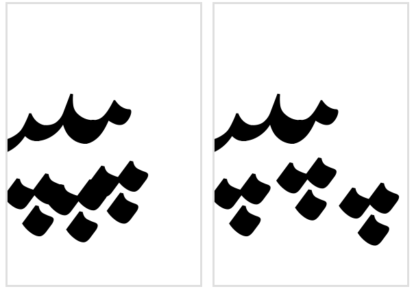
There are several problems with this approach. The first, and most serious, is that that isn’t what Nastaliq script does. Calligraphers will more often try to reposition things vertically rather than horizontally. So that wasn’t a good start. I guess the Linotype people did what they could with the technology at the time, but there’s no reason to do that now. Moving things horizontally actually stores up more problems for you - what do you do about things like لتت…? The dots have nowhere to go. So I changed it to moving dots vertically but with a slight horizontal shift to avoid clashing. (Because different glyphs have their anchors are different heights, without a horizontal shift, just raising a dot vertically might mean that it ends up clashing into the next dot which is higher up because of its anchor placement - the very thing you were trying to avoid.)
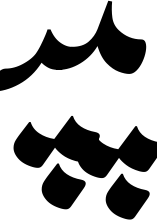
But multiple horizontal shifts still mount up, meaning that with enough consecutive dots…

Of course, you’re not going to get Urdu words like that, but it’s a hint that something is wrong. And I want this to work for arbitrary input as much as possible, for example when to allow foreign words to be transcribed into Urdu script - so a dictionary approach is not good enough.
The next problem is that implementing it is a real pain. My approach is generally that you position things using positioning rules. But in OpenType, you can’t contextually position a glyph based on the position of other glyphs. You only have access to the glyph names. So, going back to the horizontal-shift example because it’s easier to understand, to position a stream of repeated dots - let’s say the three PEH example above - you have to do it all at once. Look at that example again:
If we’re adding 100 units to each dot, we want to end up with the leftmost dot at its “natural” position (no repositioning), the middle dot at +100 and the rightmost dot at +200. Why can’t you just do something like this:
pos BE @dots BE @dots' <100 0 0 0>
and have every sequential dot add 100 units to the subsequent one? First, because that’s backwards. Dealing with Arabic in OpenType always breaks my brain because the glyph stream comes in “right to left”, and then gets reversed at the end. We want the final (leftmost) glyph to be naturally positioned, and the first (rightmost) glyph to have all the movement. But also, look at the whitespace to the right of the image above. For word-initial sequences you also have to know how much “margin” to add to the rightmost dot to stop the preceding word from clashing into it. So you need to know the totals in advance:
pos BE' <0 0 200 0> @dots' <200 0 0 0> BE' @dots' <100 0 0 0> BE' @dots';
pos BE' <0 0 100 0> @dots' <100 0 0 0> BE' @dots';
(Obviously you don’t have to do either of those things for purely vertical shifts, but remember that I started the implementation with horizontal shifts and then moved to mostly vertical and slightly horizontal, so this is the box I had painted myself into.)
You have to compute all the possible sequences of up to whatever length you want to support, and it’s all a mess.
But the reason why I finally gave up on this implementation and replaced it is because it’s a bit of a big hammer: you shouldn’t move dots just because there are two dotted glyphs in a row. You should move dots because there’s a problem you want to fix. Making the dots move vertically has helped, but we still have the issue that multiple dots can still clash because they’ve coincidentally ended up at the same height because, due to their differing anchor positions, they originally started at different heights.
What we really want is to detect if a sequence is going to clash, and fix it if it does. And this was the idea I that I had when I started the project: build a collision detector and run it while constructing the shaping rules. I never implemented that idea because, well, the Qalmi idea seemed simpler and I am lazy, and because I thought it was way too complex to get it working. You would have to test every single possible word to see if it clashed, and when you have detected a clash, how do you automatically work out how to fix it?
This week I realised that it’s actually a bit more simple than that. You don’t have to test every possible word; only about 500,000 combinations, which is tractable. The key realisation was that I should be using substitution rules for positioning, which is something I had been trying to avoid. But remember that I complained that in OpenType you don’t have access to the result of previous positioning rules. Well, you do have access to the results of previous substitutions rules - the name of the glyphs is the only thing you have. This means you only need to test sequences of three base+mark pairs at a time.
Why three? Well, we’ll start with two, to make it easier. Let’s assume that for every dot glyph, you create two variants. In fact, let’s just consider the case of three-dots-below. You have tdb, and you create variants tdb.lower and tdb.evenlower. We look at a window of two glyphs: let’s say PEH PEH.
Fez, my font engineering language, has access to a shaping engine, so it can take the anchor attachment and cursive positioning rules we have defined already, and work out where the glyphs end up being positioned. It shapes and positions the glyphs, then hands the result to Collidoscope, and notices that there is a clash for this sequence of glyphs. We then emit a substitution rule which turns the second tdb into tdb.lower. If we had three repeated PEHs before - BE tdb BE tdb BE tdb - we now have BE tdb BE tdb.lower BE tdb. But when we evaluate the next two base-mark window BE tdb.lower BE tdb, we find that it doesn’t clash, and so we don’t need a rule for that. Because the OpenType shaping system moves along the glyph stream glyph by glyph, we can create rules which resolve a clash at position A by changing the glyphs at position A+1, and by the time we get to position A+1, everything is fixed.
This also has the advantage that we don’t create rules when they aren’t needed, and we don’t get surprised by dots which started at different heights because of differing anchor positions.
So why do we need a window of three glyphs? Well, there was another problem with my original repeated dot mover, which is that sometimes you can have clashes between dots even if they’re not strictly sequential. “Thin” glyphs like medial MEEM in between your dotted glyphs can also cause problems. Imagine the admittedly nasty sequence CHEH MEEM CHEH:
You try to finesse it by dropping the dots when you see CHEH MEEM, but then you end up hitting the dots of the second CHEH.
But if you have a collision detector, it doesn’t matter whether the dots are clashing with each other or with other bases - you can just try different dot placements and see which one has no collisions. Just do that for every combination of your nine dots above (sda, sda.higher, sda.evenhigher, dda…) and your nine dots below, on all combinations of your BE, TE, and JIM variants - not forgetting that HAYC, SAD, DAL, RE, AIN, FE, QAF and TOE also take some combination of dots, and that the toeda on ڈ and the comma on heh are basically “dots” too that you need to avoid clashes with - plus an optional “thin” glyph in the middle, plus another base-dot combination, and you have around half a million cases to check. Fortunately, we have a computer.
(As it happens, clashes in a three-glyph window are ridiculously rare, and when I emitted the rules for them and tried to build the font, my GSUB table overflowed to the point of crashing fontmake. So I just moved some of the anchors around instead.)
I’m very, very pleased with the final result. It doesn’t matter what combination of glyphs you try to shape - we have already looked at it and tried to mitigate any clashes. The font will hopefully be coming out later this year, and it’ll be an open source release, which also means that I will be releasing the dot collision code and the autokerner code, together with a fuller description of how it all fits together. Because it computes the spacing parameters and the clashes based on the outlines in the source file, it’s a generic system that hopefully others will be able to use for their nastaliq fonts too. So all in all, things are good.
But I really didn’t enjoy the process of getting there. As well as having to spend half the week waiting around for font rebuilds to check the results of the auto-kerner, the process of shaping half a million combinations is also pretty slow. Each build took around an hour, and then to find a bug, fix it, and have to wait around for it to rebuild again made me very frustrated.
One of the reasons for this is just psychological. I had something that more or less worked, and I feel like I’m wasting my time by starting over to get back to where I already am. I have a dot collision avoidance system; now I’m writing another one? But by the end of Friday what I had was so obviously better than what I had at the start of the week, I’m beginning to get over that.
The other reason is because I’m an idiot. When I profiled my dot collision code, I realised that it was spending almost all - over 90% - of its time creating logging messages to debug the shaping engine, including dumping all of the positioning rules in Adobe feature format. Even though I had logging turned off, every call to
logger.debug("Applying rule %s" % rule.asFea())
was constructing a feature file and sending it to a function which then ignored it.
I replaced it with
logger.debug("Applying rule")
The font built in five minutes.