Measuring optical sizes
For the last year or so, Yanone has been working on a very interesting tool called Fontquant. The aim of the tool has been to help to quantify the technical quality of the font. It can tell you whether superior and inferior numerals are present; it can tell you which glyphs have small-caps. It determines information about the font’s appearance: it works out that Open Sans has a double-story g, that Farro’s numerals are proportional lining by default.
In the course of doing all those things, it does various bits of measuring things about the glyphs, and it can return that information as well - it reports that Ysabeau has a stroke contrast ratio of 63% and a pen angle of 10°. A while back I added support for measuring David Berlow’s Parametric Axes, and so now it can tell me that Lobster has an XTRA value of 147 and YOPQ of 175.
So I see fontquant not just as a tool for determining technical quality but as a toolbox for measuring font-related quantities.
Now that Yan has moved on to funkier things (with a very interesting new Arabic font release coming soon!), Fontquant has landed on my plate. I have two jobs to work on: first, moving it to Rust to make it fast fast fast and to integrate with the rest of our Rust tooling; and second, to see if I can add more metrics to try to place fonts within the typographic system of a font library. For example: optical size!
Can we say that a font has a “natural” optical size? We know (thanks to Tim and Shoko!) that what we call “optical size” is a set of adjustments made to a design to make it work better at certain point sizes: adjustments to contrast, ascenders and descenders, spacing, x-height, and so on. Such that, for a variable font with an optical size axis, we can assign an optical size value to the design at certain points on the axis:
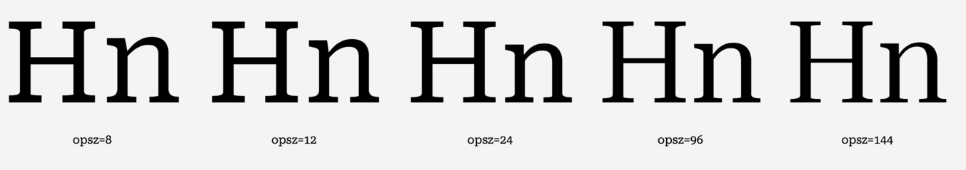
Why? Because the adjustments to the left make the font look good for text sizes and the adjustments to the right make it look good for display sizes. In fact, if you have a parametric font, you can use the parametric value adjustments to generate the opsz masters.
Presumably, therefore, we can go the other way around: for a given design, there should be some kind of relationship between the stroke contrast, spacing, vertical metrics, and parametric values such that when we measure these values, we can work out the “natural” optical size for the design. Of course, of course, the precise calculation ought to be different for each design and relates to the taste of the designer - but if we, as a whole, believe that certain things make a design more suited to text and other things make it suited to display, shouldn’t those “things” be, at least roughly, measurable and reproducible?
Fortunately, using fontquant, we can try to work this relationship out. (Spoiler: I haven’t got there yet, and would appreciate input. But I have some potentially interesting data.) We take a bunch of fonts with an opsz axis - I just happen to have the Google Fonts catalogue right here - and we plot the measured values from fontquant at different points on the axis and see if they tell us anything. Here are some things from Tim and Shoko’s book that we should be looking for. We expect smaller opsz to mean:
- heavier weight: “Whenever consistency is an aim in designing optical sizes the weight needs to be increased in small sizes in order to maintain the overall perceived tone.”
- reduced stroke contrast: “The most important - sometimes the only - adjustment in small sizes is the reduction of stroke contrast.”
- wider letters: “The width of the letters generally needs to be increased for small sizes.”
- larger x-height: “In the smaller sizes the x-height is increased very often.”
- smaller extenders: “At the same time the ascenders and descenders are shortened.”
- larger apertures: “…the increase of the lower case counter size in the smaller sizes.”
- simplified shapes: “it is advisable to simplify the shapes in smaller sizes”
- heavier serifs: “They should be given more weight in smaller sizes…”
- looser spacing: “If the fonts are to be used predominantly in rather loose layouts like books, the default spacing should be looser than, for example, in fonts for newspaper headlines.”
And now… let’s see the results. We plot optical size on the X axis, and other font features on the Y axis:
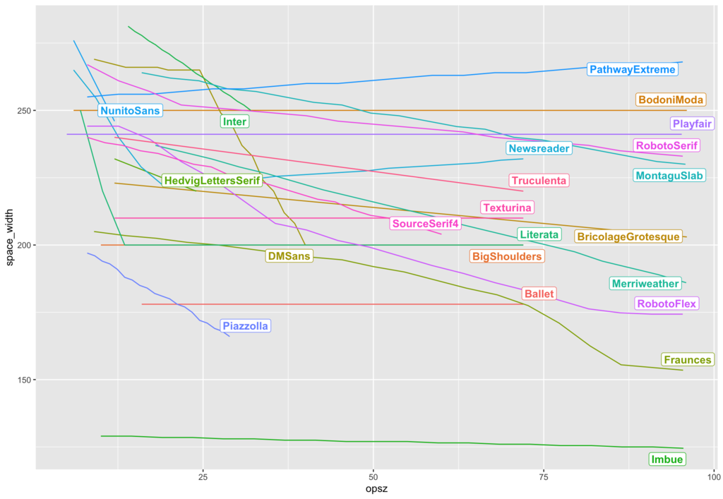
We’ll start with word space. In most fonts with an optical size axis, word space decreases as opsz increases. But in a few fonts (Bodoni Moda, Texturina, Literata), it does not change, and in Pathway Extreme, it increases.
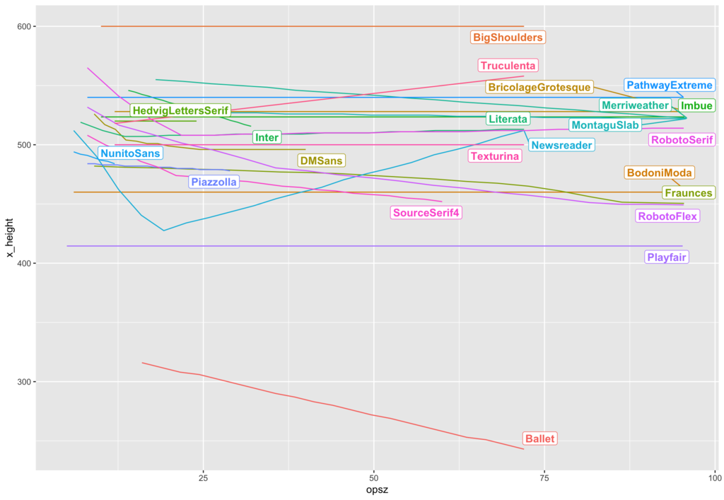
Next we look at x-height. This is the most confusing one for me! In Newsreader and Roboto Serif, x height decreases up to opsz=20 or so, then starts increasing again. In Truculenta, it goes up; in Roboto Flex, Source Serif, Fraunces and Merriweather it decreases fairly linearly; in other fonts, it goes down.
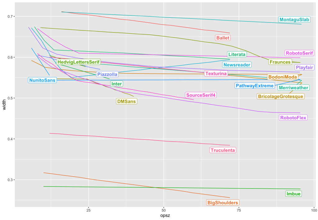
Width is fairly consistent. In most designs, smaller sizes are wider. Usually the change over optical size is linear, although there are some designs which get dramatically wider in the very small optical sizes.
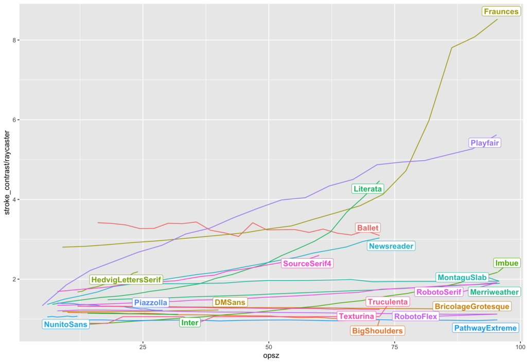
Stroke contrast again behaves reasonably well. For some fonts the contrast doesn’t change particularly much (warning: this may be due to the way that we’re measuring stroke contrast, which was not particularly easy), but if it does change, large sizes have more contrast.
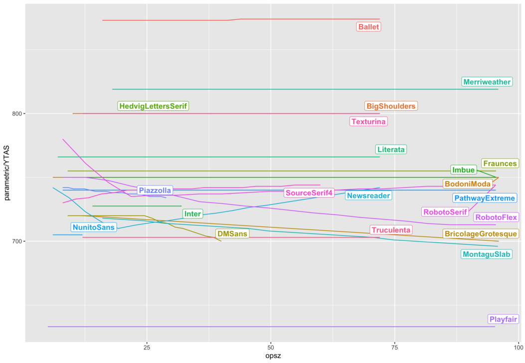
Ascender height doesn’t really change. Sorry, Tim. What about weight?
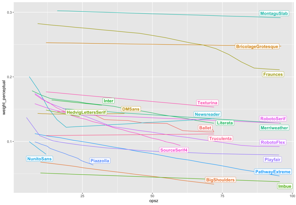
This one broadly works as well. Fonts get heavier at small sizes and lighter at large sizes - most of the time.
But what about relating these values together? Is there some formula where we can plug in all the weight, stroke contrast, and parametric values and get an optical size value out? I’m not sure. I haven’t found an obvious one yet, although I have managed to train a regression model that claims to fit the data with R² = 0.90 on test (i.e. unseen) data. Which sounds good, but these things always sound good until you try them, though, and they seem to quickly fall apart afterwards.
I feel like there should be some kind of obvious relationship, given all we know about how optical sizes work. But maybe in practice, it isn’t as obvious as all that.