Neural Kerning Log
I know I said I wasn’t going to do anything more about kerning/spacing with neural networks. But, well, I have a GPU and it’s bored. I have also realised that, for the sake of posterity (and to stop myself from going around in circles doing things I’ve already tried), I should write up all the things I’ve learned and what has worked (very little) and what hasn’t (pretty much everything).
What fascinates me about the problem of automatic font spacing is that (a) it feels like the sort of thing we have computers for; kerning n by n pairs (where in modern fonts n can be more than three or four hundred) should not be the sort of thing that humans do. But at the same time (b) it feels like it ought to be a really simple problem, and shouldn’t be too hard for computers to solve, and yet actually it turns out to be a complete nightmare in practice. I mean, look at it: you just make sure that the space between each pair of glyphs looks kind of the same. How hard can it be? Ah, my padawan, if only you knew.
I should also add at this point that I don’t think neural networks are the answer. Sure, they can play go better than humans, and they should be able to do everything - but see (b) above. I am getting far more reliable outputs from simpler approaches based on measuring area directly. And simpler approaches are much easier to reason about than neural networks.
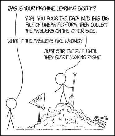
But… neural networks are fun to train. And my GPU is bored. So here are the things I’ve tried so far and all the lessons I’ve learned from them. (One final aside: if I had been a disciplined and dilligent researched I would have checked in every single change I made into git and written up what worked and what didn’t. Instead I just kept hitting Ctrl-C, frobbing the code a bit, and trying again. In fact, the number one take away from this post should be: make comprehensive and systematic notes when doing any machine learning stuff.)
atokern
My first experiments worked like this: take a bunch of fonts, and for each font, choose a pair of glyphs. For each of the glyphs (and “key” glyphs such as “H” and “o”) sample the distance between the edge of the bounding box (including the glyph’s sidebearings) and the ink of the glyph, all along the y axis.
The hypothesis is that the shape and size of white-space at the right of the left glyph and the white-space at the left of the right glyph, combined with the overall setting of the font, is the only information you need to fit the glyphs properly, and so we may as well do that feature engineering ourselves rather than get the machine to do it. The problem is that I don’t know if this hypothesis is true.
For output, what we are trying to find is the kerning value which makes that pair fit properly (it’s already spaced since we have the sidebearings), so we bin a bunch of possible kerning values and use them as a set of categories for the ground truth, treating it as a multi-way categorization problem.

You can assume, for all of these attempts, that I tried a huge amount of stuff not listed here. For example, different network architectures and different combinations of input (adding / not adding the left and right samples for different key glyphs “H”, “o”, “n”, etc., adding / not adding m-width).
This wasn’t too bad but it was simply not reliable. A big problem with using neural networks as an automated solution to kerning is that it might get, say, 98% of your kern pairs right but 2% of them completely wrong. For 300x300 pairs that’s still 1800 errors, which is an awful lot. But worse, you don’t have any clue which 1800 pairs it’s going to be and why. So you have to check them all anyway, which makes the whole “automated” thing less compelling. And when you look at the ones that it gets totally wrong, you realise that the network hasn’t really modelled what it means to fit two letters together. So that failed.
I initially tried to train atokern with a huge number of kerning categories (something like 20), exponentially binned ranging from minus 100 units or so to plus 100 units. I also tried training it as a discriminator (does this need kerning?), with three categories (too tight, just right, too loose), and as a regressor (what kern value should this be?). Categorisation for kern values was better than regression. Three-way categorisation would behave strangely: it would say “too tight!” and you’d loosen the pair until it was way too loose and then it would say “too loose!” Thanks. So that failed too.
But looking back on it, atokern taught me a bunch of lessons like:
- Scaling. I started just using font units for all the inputs: the Y-axis sample distances going in, and the kern values coming out. But that doesn’t compare well across fonts (especially if units-per-em is different between fonts!). So I switched to using fractions of a font’s em size.
- Positioning. When I say “samples all along the y axis”, where do we start and end, and why? If we take a hundred samples from descender to ascender, that’s going to end up with some fonts being stretched more than others; with baselines appearing at different coordinates; and so on. Should descenders be included? Should we just sample from baseline to x-height? Doesn’t that still end up with some glyphs being stretched?
- Trust. What pairs do you feed into the network? How robust is it going to be about garbage data? For example, the network randomly grabs the pair “Qj” and finds that, in the font, it has a kerning value of zero. Hoorah, this pair is perfectly fitted and requires no adjustment. Let’s feed that information into the network. But wait. In reality, there’s a clash, and the pair looks horrible. Perhaps a kern value of zero means that the pair is perfectly fitted already, but it might also mean that the designer never actually looked at the pair “Qj” and assigned it a value. So you want to feed a set of shapes that is general enough that the machine can learn how all kinds of different shapes fit together, but specific enough that you have confidence that the fitting is accurate.
- Subjectivity. What one designer thinks looks “good enough” and what another designer thinks looks right can be quite different. In many cases you’ve probably got about 10 or 20 units leeway either side in which a pair can still look OK. So ground truth isn’t exactly “ground truth”.
- Incredibly unbalanced classes. One problem with trying to assign kerning values to already spaced pairs is that 99% of them are going to be zero. Your network will learn that it can achieve 99% accuracy by predicting zero for everything. Fail. So instead you artifically feed it lots of pairs that need kerning. But that isn’t the ground truth distribution, and you end up with it trying to kern everything. Fail. And yes, I played with sample weights and class weights and everything else.
- Generalisation versus specification. Oh goodness. This one still haunts me. The usual rule when training an NN is to start on a small data set and then add data to increase generalisation. I found it could train the system on, say, one font family, and it would be great. But of course that wouldn’t generalise to fonts outside that family. So you add more data… at which point it stops converging. So you go back to solving a simpler problem… rince, and repeat. And what do we mean by more data anyway? More fonts? More pairs within the fonts we have? Suppose you have twenty fonts and you supply
[a-zA-Z]against[a-zA-z]for each font - that’s over 50,000 data points, which should surely be enough to train a neural network. But it’s only twenty fonts. Do you go wide or deep or both?
atospace
The unbalanced classes problem was the main reason why I gave up and rethought. Seeing the problem as a gestalt, the issue is not “how much does this pair need kerning?” but “how much space should be between these two glyphs to make them look right?” So atospace dropped the sidebearings and just measured the contours of the glyphs, and tried a regression approach to find the right spacing.
I still hadn’t really solved the scaling and positioning problems at this stage. And unconstrained regression problems seem to be horribly unstable. (No, I don’t believe my “xo” pair needs to be 700 units apart.) I also find it hard to evaluate the performance of regression systems. I tried using sigmoid activation and scaling the output from 0em to 1em, and it would converge beautifully on the fonts that I trained and tested it on, and the loss goes down to 0.002. That sounds pretty low! So I’d apply it to an unseen font from my validation set, and suddenly it would predict that every pair should be set at 1em apart, or something crazy like that. I tried making custom metrics, where we looked at what percentage of the predictions were within 5 units of the correct answer (but see “trust” and “subjectivity” above), but I never managed to get any validation results more than about 35%.
So I gave up.
More recent experiments
One thing which really helped to define the problem better was writing the tensorfont library. This helps with the problem of converting glyphs to numpy arrays, and also forced me to think about the scaling and positioning issues. It also provided me with a toolkit to create a number of experiments in rapid succession. None of them worked.
- I did atospace again, just using tensorfont to extract the contour information. Nope.
- Then I did it again, but with correct positioning and scaling. Nope.
- Instead of feeding the contours in, I fed each glyph image (left, right, key glyph) into a separate convolutional network, concatenated them together and stirred. Nope.
- Then I fed in the combined image
Ho[left][right]oH, adjusting the spacing artificially between the left and right pair, and made a discriminator tell me whether or not it was correctly kerned.
Ah. Now, that one wasn’t too bad. I like the idea of having a command line tool that takes your font and says “Hey, just have a check over these pairs, will you?” The problem, here, though was sensitivity and subjectivity. If you train the discriminator on a mix of correctly kerned and obviously bad pairs (like when there are clashes or the word image breaks down), it’s very easy to train and converges beautifully, but it is essentially useless because it only tells you about obviously bad pairs. But that’s exciting, right, because it’s getting the idea of what makes an image well-kerned or badly-kerned? So all you need to do is adjust the range of spacing that you’re artificially introducing, and train it on a mix of correctly kerned and subtly bad pairs. But then it’ll start telling you that your validation set is subtly bad, even when it isn’t. Head, meet wall.
Today’s approach is “here’s a word image. how much do we need to shift this pair to make it look fitted?” I feed it a mix of well-kerned pairs and pairs which have been artificially adjusted by a random value of -80 units to 80 units, and scale that down to -1 and 1, adding a tanh activation on the end.
It seems to converge quite nicely, so I feed it a new font it hasn’t seen before, and it predicts:
(a, a) -1.0
(a, b) -1.0
(a, c) -1.0
(a, d) -1.0
(a, e) -1.0
(a, f) -1.0
...
I hate neural networks.