How to stop worrying and learn to love mark-to-base
If you’re doing any kind of work with Indic or Brahmic scripts, you’re going to love what I have to say today.
I was talking with a designer recently about extending the conjunct support of a particular font, and they, rather sensibly, were worried about the impact of this on the glyphset. If we add literally hundreds of new conjuncts, isn’t the font source file going to get huge and unwieldy and difficult to maintain? The good news is, no, not necessarily; the bad news is, you need to do a bit more planning, but it’s worth it.
Let’s start with a simple example. I’m going to use (a very shortened form of) the Myanmar script here because it’s very easy to see the principle at work. Suppose we have the following base consonants in the font already:
န က လ တ မ ဗ ပ သ စ
and we want to support the following 36 conjuncts:
န္က က္က လ္က တ္က မ္က ဗ္က ပ္က သ္က စ္က
န္န က္န လ္န တ္န မ္န ဗ္န ပ္န သ္န စ္န
န္ပ က္ပ လ္ပ တ္ပ မ္ပ ဗ္ပ ပ္ပ သ္ပ စ္ပ
န္စ က္စ လ္စ တ္စ မ္စ ဗ္စ ပ္စ သ္စ စ္စ
How many extra glyphs do you need to add to the font? For some designers, the answer would be obvious: if you want to support 36 new conjuncts, you’re going to need 36 new glyphs. In fact, the answer is actually five.
The trick is to realise that the top part of the conjunct is almost always just the normal base consonant (apart from the first one which uses a short tail), and the bottom part of the glyph is the same in each row. So the only glyphs you need to add are the short form of the letter န (with no tail) and the subjoined form of the က, န, ပ, and စ.
Now, part of a well-organised font development process is realising that these things can be made out of components. So I hope that even if you were going to be adding 36 new glyphs, you’d add the five component glyphs that we talked about and build your glyphs out of components. But you still need to add the components into a glyph, right, to make up the conjunct?
Let’s clear this up, because it’s a mistake I see a lot: anything that has a Unicode codepoint, that you want the user to be able to address using that Unicode codepoint, needs to have its own glyph. This is so that the Unicode character gets mapped into a glyph in the font. You might then do various substitutions or whatever with that glyph and turn it into something else, but you have to start somewhere.
But the converse is also true: anything that does not have a Unicode codepoint does not need its own glyph, because you’re going to reach it through other means - various substitutions or whatever. And this means that conjuncts, which are normally produced via virama combinations and which don’t have their own Unicode codepoints, don’t need their own glyphs. We can create them another way.
In the case of the Myanmar examples above, we are given text like “KA VIRAMA PA” which (being Unicode codepoints) gets mapped to glyphs ka-myanmar|virama-myanmar|pa-myanmar , and we can use OpenType substitution rules:
sub virama-myanmar pa-myanmar by pa-myanmar.sub;
sub virama-myanmar ba-myanmar by ba-myanmar.sub;
...
to give us ka-myanmar|pa-myanmar.sub. And to turn န into its short-tailed glyph variant when there are things underneath it, we also do:
sub na-myanmar' @subjoined by na-myanmar.short;
Next, we have to connect them together. One way to do this is to simply give the subjoined forms a large negative sidebearing, so that they sit underneath the base glyphs:
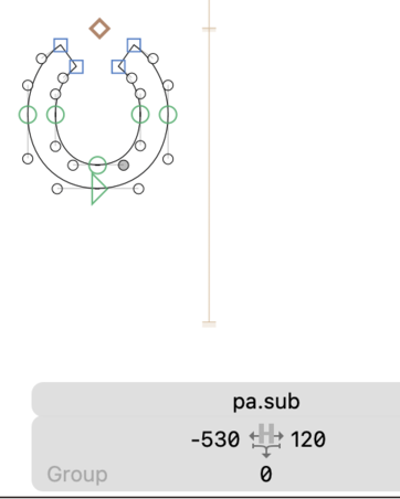
You can kind of get away with this in Myanmar, because of the very regular spacing of the bases. But even then, there’s a better way to do it: treat the subjoined forms as accents. By which I mean, turn them into mark glyphs, and use anchors to attach them to the bases.
You may have seen anchors as a way to make precomposed forms: you add anchors to your A and your acutecomb glyphs, and when you add an Aacute glyph, the components are in the right place. But it’s better than that: if you add anchors to your A and your acutecomb, you don’t actually need an Aacute glyph. Your font editor produces some OpenType code called mark-to-base rules, which ensures that when the acutecomb appears after the A, the mark (in this case, acutecomb) get pasted onto the base (A) in the right position.
Anchors essentially give us a way to use glyphs as components of another glyph at rendering-time, without needing to have the precomposed form in the design sources.
In fact, you can do this for as many marks as you like: if you have two marks following a base, they will both attach to the base to start with. Here’s an example in Noto Naskh Arabic of having multiple anchors on a base with different glyphs attaching to them:
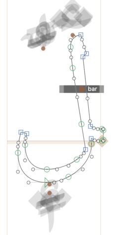
The bar-ar glyph has a _bar anchor and the damma-ar glyph has a _top.far anchor, so if you have the sequence lam-ar.fina|bar-ar|damma-ar then the bar goes across the middle of the stroke and the damma goes up to the top-left corner:
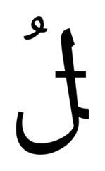
There’s no lamBar_damma-ar.fina glyph in the font here; the three glyphs are being positioned together by the shaping engine.
(There’s another trick here: if the marks themselves have anchors on them, you can combine multiple marks together; one mark gets positioned according to the anchor on the previous mark, and so on.)
Maybe you knew that already. But let’s apply this to the conjunct situation. You may have already seen in the image above that our subjoined ပ has an anchor. Now we add two anchors to our base glyph, one for double-bowled subjoined glyphs and one for single-bowled ones:
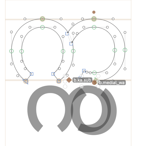
When the conjunct is rendered, the shaping engine will swing the subjoined consonant underneath the base and glue them together in the right place.
“Sure, that works fine for Myanmar,” you might say, “because all the bits of the compound are regular and separate. What about something like Devanagari, where they all join together?”
Well, to start with, they don’t all join together. Noto Sans Devanagari, for example, has 874 glyphs. A good hundred of these can just go; they don’t need to be in the font. There are things like khh-deva which is literally just a precomposed form of kh-deva|nukta-deva. If we used anchor attachment to put the nukta on the right place in the kh-deva, job done. Even things like attaching u- and uu-matras could be done in many cases (but not all) with anchor attachment, instead of precomposed glyphs.
“But that’s not exactly conjuncts, is it?” No, it’s not, but the same principle applies. d_ra-deva doesn’t need to be there; it could just be da-deva|rakar-deva and attach the rakar, and so on. You may need to draw several different rakar glyphs with different lengths, angles, etc., and then use OpenType rules to select the appropriate form to go with each given base. But if you draw these add-on bits like u vowels and rakars as components, then you’ve already know which forms to choose for each base glyph, so writing the OpenType code isn’t that hard.
And this is where the idea of planning comes in. John Hudson says that the first tool he uses when designing an Indic font is a spreadsheet, and I can understand this now: work out what glyphs derive from other glyphs, what portions of glyphs can be reused as components and - just as importantly - what portions can’t. As a programmer, I naturally think in terms of trying to arrange things into reusable blocks as much as possible When you’re designing a system, you think in terms of using reusable components as much as you can, because by doing so you reduce the total number of bits of the system you have to maintain, and you also ensure that when you make a change to one of the components it is reflected everywhere throughout the system - you don’t have to make the change more than once. So componentization is way more maintainable.
But course type design is somewhat different - I know that glyphs are not made up of interchangeable building blocks in the way that software programs are, and that the addition of one component may require a change of shape to make room, or a change of connecting stroke, or whatever.
It would be nice if these were the same base. But they’re not.
Even so, however, there will be places where you can use this technique (especially, for example, in fonts supporting multi-level conjunct stacks). So planning ahead, spotting potential commonalities between glyphs (maybe several glyphs get adjusted in the same way when different things are added to them, so these could be split into a separate base glyph), and trying to think systematically about component reuse and anchor attachment is the only way to avoid “glyphset explosion” in a font with many conjunct glyphs.
Let’s finish by thinking about why you might, and might not, want to use the anchor attachment technique to reduce your glyphset.
Positives:
- It makes the font more maintainable, in terms of fitting it into your mental headspace, by reducing the amount of glyphs you have to care about.
- It makes the font more maintainable, in terms of work, because a change in one mark glyph affects every conjunct which uses it.
- It makes the binary font smaller. (I recently re-engineered an Arabic font and shaved 20% of the file size by decomposing all the composed glyphs.)
Negatives:
- It requires more planning.
- It has to be applied carefully, thinking through which glyphs it is appropriate for and which it is not.
- Maybe you’re being paid per glyph; then it’s not a good idea.
- It’s harder to visualize in your font editor what the outcome is going to look like.
The last negative is, I think, perhaps the biggest deal here. (Apart from maybe the last but one…) Designers - rightfully - want to feel in control over what the font is going to look like, and when you use precomposed forms, the glyph is right there. It’s in a little box in your font editor and you can see what it’s doing, and if it’s doing the wrong thing, you can move stuff about until it does the right thing. When the letterform only appears when the text is rendered, that’s a step or two removed. Adjusting anchors is a bit more fiddly than moving components. I get it.
So maybe there are ways our font editors can help with this. I use the “Show Anchor Cloud” plugin to Glyphs which allows me to visualize how all (or some) of the marks attach to a base - see the example of the က glyph above. And that helps, a bit, but I wonder if there are still better ways we can make the process of decomposed conjuncts easier. Any ideas appreciated!
