A Brief History of Type
- Digital fonts go vector
- A post script
- PostScript Fonts, TrueType and OpenType
- From TrueType to OpenType
- Multiple Masters and Variable fonts
Once upon a time, a font was a bunch of pieces of metal. The first recorded use of metal type for printing comes from China. In 13th century, banknotes were printed with anti-counterfeit devices printed using blocks of bronze;1 the first metal type books were produced in Korea around the same time.2 Two hundred years later, Johannes Gutenberg came up with a similar system for creating metal type that would spread rapidly over Europe and continue to be the most common means of printing until the 19th century.
To create type for printing, engravers would work the images of letters, numbers and so on into punches. Punches would then be struck into a mold called a matrix. The typemaker would then use the matrices to cast individual pieces of type (also known as sorts). A complete set of type sorts in the same size and style was collected together into a font of type.
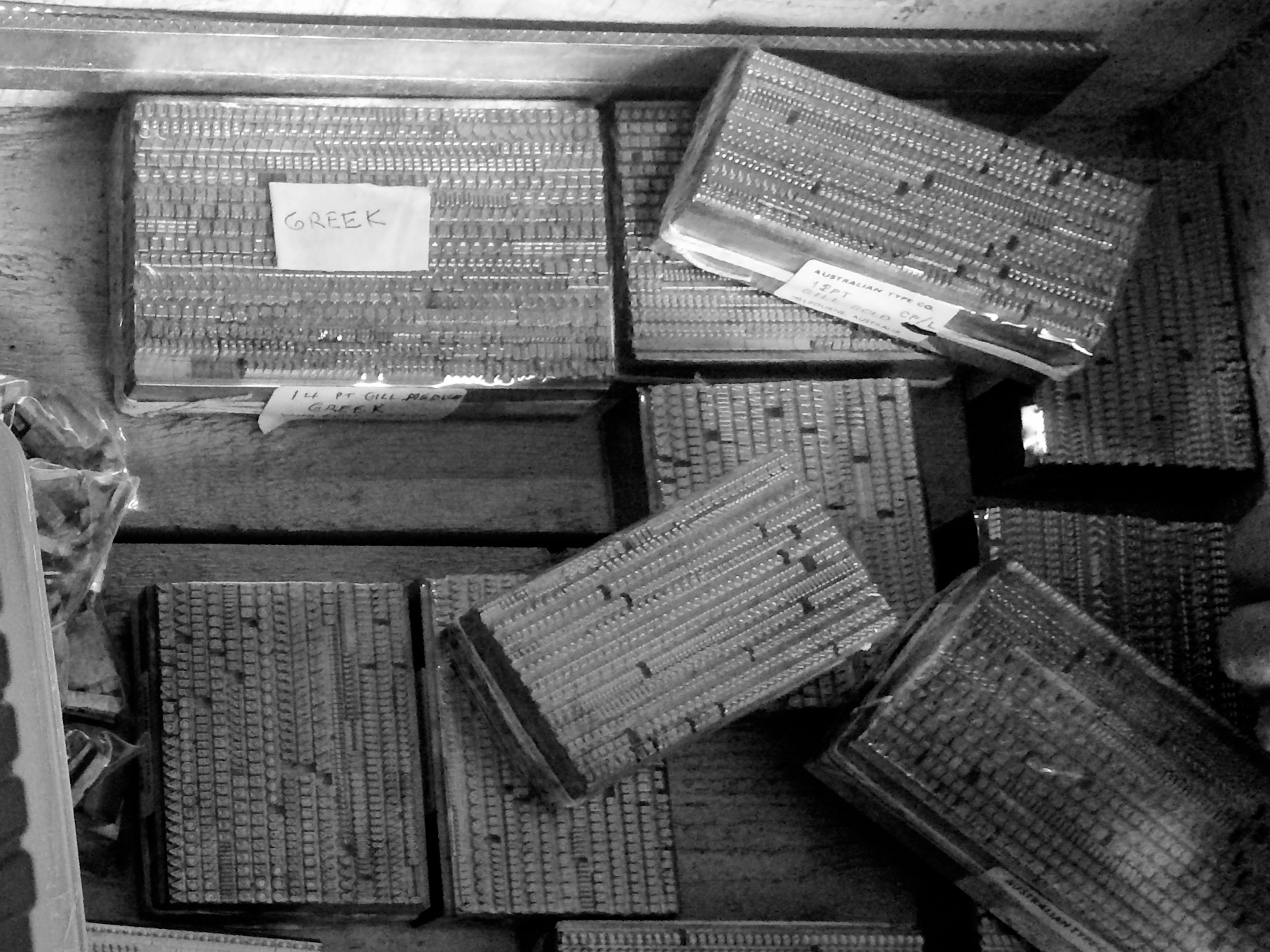
A box of fonts cast by the Australian Type Foundry. The font on the top left is a 14pt Greek typeface by Eric Gill.
Complete fonts of type would be placed into type cases, from which compositors would then select the sorts required to print a page and arrange them into lines and pages. Next, the printer would cover the face of the metal with ink and impress it onto the paper. With the advent of hot metal typesetting, which combined casting and compositing into one automated activity, the idea of a font of type fell out of fashion.
The idea was revived with the advent of digital typography. In 1964, the IBM 2260 Display Station provided one of the first text-based visual interfaces to a computer.3 The mainframe computer would generate the video signal and send it to the terminal, pixel by pixel: each character was 9 pixels wide and 14 pixels tall. The choice of bitmaps for each character, what we would now call the font, was hard-wired into the mainframe, and could not be changed.
Much has changed since the early bitmap fonts, but in a sense one thing has not. The move from Gutenberg’s rectangular metal sorts to rectangular 9x14 digital bitmaps ensured that computer typography would be dominated by the alignment of rectangles along a common baseline - an unfortunate situation for writing systems which don’t consist of a straight line of rectangles.

No OpenType for you!
This is one of the reasons why I’m starting this book with a description of digital font history: the way that our fonts have developed over time also shapes the challenges and difficulties of working with fonts today. At the same time, the history of digital fonts highlights some of the challenges that designers and implementers have needed to overcome, and will equip us with some concepts that we will get further into as we go through this book. So even if you’re not a history fan, please don’t skip this chapter - I’ll try and make it as practical as possible.
For example, then, in the case of the wonderful Nastaleeq script above, we can understand why this is going to be difficult to implement as a digital font. We can understand the historical reasons behind why this situation has come about. At the same time, it highlights a common challenge for the type designer working with global scripts, which is to find ways of usefully mapping the computer’s Latin-centered model of baselines, bounding boxes, and so on, onto a design in which these structures may not necessarily apply. Some of these challenges can be overcome through developments in the technology; some of them will need to be worked around. We will look at these challenges in more detail over the course of the book.
Digital fonts go vector
As we saw, the first computer fonts were stored in bitmap (also called raster) format. What this means is that their design was based on a rectangular grid of square pixels. For a given glyph, some portion of the grid was turned on, and the rest turned off. The computer would store each glyph as a set of numbers, 1 representing a pixel turned on and 0 representing a pixel turned off - a one or zero stored in a computer is called a bit, and so the instructions for drawing a letter were expressed as a map of bits:
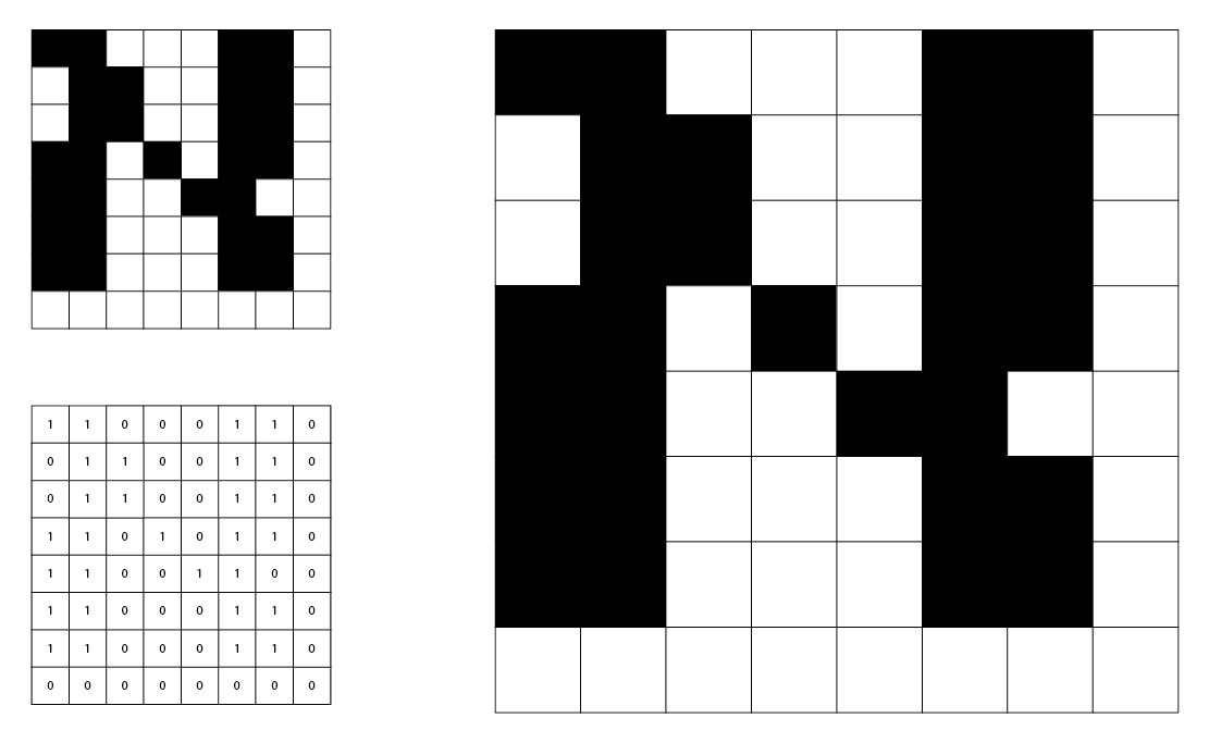
Capital aleph, from the Hebrew version of the IBM CGA 8x8 bitmap font.
This design, however, is not scalable. The only way to draw the letter at a bigger point size is to make the individual pixels bigger squares, as you can see on the right. The curves and diagonals, such as they are, become more “blocky” at large sizes, as the design does not contain any information about how they could be drawn more smoothly. Perhaps we could mitigate this by designing a new aleph based on a bigger grid with more pixels, but we would find ourselves needing to design a new font for every single imaginable size at which we wish to use our glyphs.
At some point, when we want to see our glyphs on the screen, they will need to become bitmaps: screens are rectangular grids of square pixels, and we will need to know which ones to turn on and which ones to turn off. But we’ve seen that, while this is necessary to represent a particular glyph at a particular size, this is a bad way to represent the design of the glyph. If you think back to metal fonts, punchcutters and metalworkers would produce a new set of type for each distinct size at which the type was used, but underlying this was a single design. With a bitmap font, you have to do the punchcutting work yourself, translating the design idea into a separate concrete instance for each size. What we’d like to do is represent the design idea, so that the same font can be used at any type size.
We do this by telling the computer about the outlines, the contours, the shapes that we want to see, and letting the computer work out how to turn that into a series of ones and zeros, on pixels and off pixels. Because we want to represent the design not in terms of ones and zeros but in terms of lines and curves, geometric operations, we call this kind of representation a vector representation. The process of going from a vector representation of a design to a bitmap representation to be displayed is called rasterization, and we will look into it in more detail later.
The first system to represent typographical information in geometrical, vector terms - in terms of the lines and curves which make up the abstract design, not the ones and zeros of a concrete instantiation of a letter - was Dr Peter Karow’s IKARUS system in 1972.4 The user of IKARUS (so called because it frequently crashed) would trace over a design using a graphics tablet, periodically clicking along the outline to add control points to mark the start point, a sharp corner, a curve, or a tangent (straight-to-curve transition):
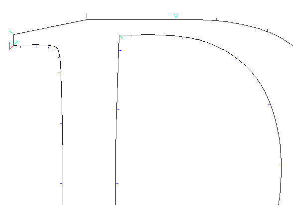
A glyph in IKARUS, showing start points (red), straight lines (green), curve-to-straight tangents (cyan) and curves (blue).
The system would join the line sections together and use circular arcs to construct the curves. By representing the ideas behind the design, IKARUS could automatically generate whole systems of fonts: not just rasterizing designs at multiple sizes, but also adding effects such as shadows, outlines and deliberate distortions of the outline which Karow called “antiquing”. By 1977, IKARUS also supported interpolation between multiple masters; a designer could draw the same glyph in, for example, a normal version “A” and a bold version “B”, and the software would generate a semi-bold by computing the corresponding control points some proportion of the way between A and B.
In that same year, 1977, the Stanford computer scientist Don Knuth began work on a very different way of representing font outlines. His METAFONT system describes glyphs algorithmically, as a series of equations. The programmer - and it does need to be a programmer, rather than a designer - states that certain points have X and Y coordinates in certain relationships to other points; unlike IKARUS which describes outer and inner outlines and fills in the interior of the outline with ink, METAFONT uses the concept of a pen of a user-defined shape to trace the curves that the program specifies. Here, for example, is a METAFONT program to draw a “snail”:
% Define a broad-nibbed pen held at a 30 degree angle.
pen mypen;
mypen := pensquare xscaled 0.05w yscaled 0.01w rotated 30;

% Point 1 is on the baseline, a quarter of the way along the em square.
x1 = 0.25 * w; y1 = 0;

% Point 2 is half-way along the baseline and at three-quarter height.
x2 = 0.5 * w; y2 = h * 0.75;

% Point 3 is below point 2 and parallel with point 1.
x3 = x2; y3 = y1;

% Point 4 is half way between 1 and 3 on the X axis and a quarter of
% the way between 2 and 1 on the Y axis.
x4 = (x1 + x3) / 2;
y4 = y1 + (y2-y1) * 0.25;

% Use our calligraphic pen
pickup mypen;

% Join 1, 2, 3 and 4 with smooth curves, followed by a line back to 1.
draw z1..z2..z3..z4--z1;
The glyph generated by this program looks like so:
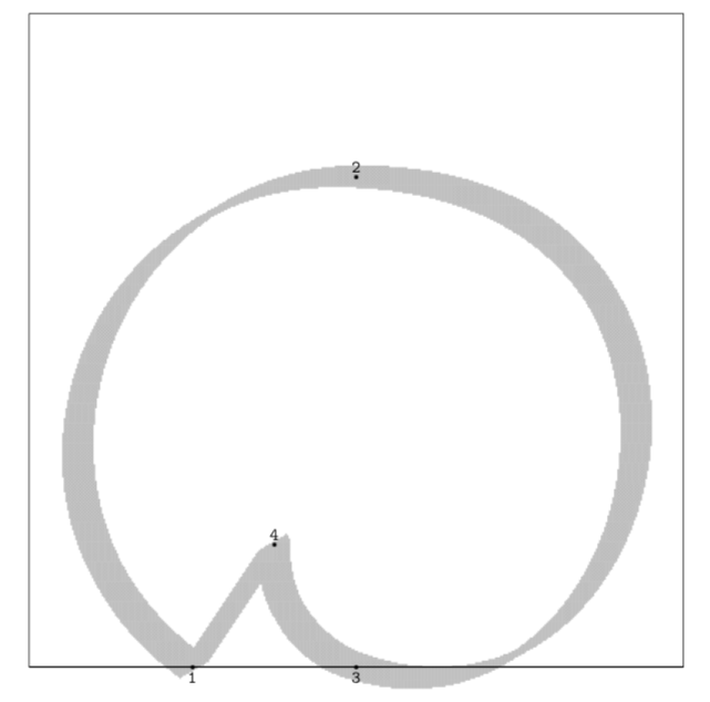
A METAFONT snail.
The idea behind METAFONT was that, by specifying the shapes as equations, fonts then could be parameterized. For example, above we declared mypen to be a broad-nibbed pen. If we change this one line to be mypen := pencircle xscaled 0.05w yscaled 0.05w;, the glyph will instead be drawn with a circular pen, giving a low-contrast effect. Better, we can place the parameters (such as the pen shape, serif length, x-height) into a separate file, create multiple such parameter files and generate many different fonts from the same equations.
However, METAFONT never really caught on, for two reasons. The first is that it required type designers to approach their work from a mathematical perspective. As Knuth himself admitted, “asking an artist to become enough of a mathematician to understand how to write a font with 60 parameters is too much.” Another reason was that, according to Jonathan Hoefler, METAFONT’s assumption that letters are based around skeletal forms filled out by the strokes of a pen was “flawed”;5 and while METAFONT does allow for defining outlines and filling them, the interface to this is even clunkier than the draw command shown above. However, Knuth’s essay on “the concept of a meta-font”6 can be seen as sowing the seeds for today’s variable font technology.
As a sort of bridge between the bitmap and vector worlds, the Linotron 202 phototypesetter, introduced in 1978, stored its character designs digitally as a set of straight line segments. A design was first scanned into a bitmap format and then turned into outlines. Linotype-Paul’s “non-Latin department” almost immediately began working with the Linotron 202 to develop some of the first Bengali outline fonts; Fiona Ross’ PhD thesis describes some of the difficulties faced in this process and how they were overcome.7
A post script
Also in 1978, John Warnock was working at Xerox PARC in Palo Alto. His research project, on which he worked together with Chuck Geschke, was to develop a way of driving laser printers, describing way that the graphics and text should be laid out on a page and how they should look. Prior to this point, every printer manufacturer had their own graphics format; the idea behind the Interpress project was to create a language which could be shared between different printers. However, other manufacturers were not interested in the Interpress idea, and it also had a “careful silence on the issue of fonts”,8 so the project was shelved.
Still, it was a good idea, and Geschke and Warnock left Xerox in 1982 to found their own company to further develop the ideas of Interpress into a system called PostScript. The company was named after a small stream at the back of Warnock’s house: Adobe. Adobe PostScript debuted in 1984, with the first PostScript printer appearing in 1985.
The first version of PostScript was not at all silent on the issue of fonts, and contained a number of innovations which have shaped font technology to this day. The first is the development of hinting. Although vector fonts can be scaled up and down in ways that bitmap fonts cannot, we mentioned that at some point, they need to be rasterized. This is evidently the case for on-screen view, where the screen is made up of discrete phosphor-coated glass, liquid crystal or LED cells; but it is also the case when the designs are printed: digital printers also work on the concept of discrete “dots” of ink.
One way to rasterize would be to simply say that a pixel is “on” if more than a certain proportion - 50%, for example - of its surface is covered by the outline. Unfortunately, when the pixels are quite large compared to the outline (when the font is being displayed at small sizes), this strategy leads to quite unattractive results.
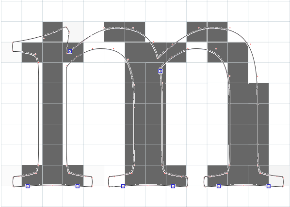
The perils of simplistic rasterization
We see that key parts of serifs and strokes are missing, and that stem widths have become uneven. Rasterization can also lead to points which should be aligned (such as the tops of the downstrokes of the m) becoming misaligned, although this has not happened in this example.
Hinting is a way of giving information to the rasterization process to help communicate what is important about the design: which stems need to be preserved and have the same width as others, where the baselines, x-heights, cap heights and other important places are that pixels should align in nice straight lines. PostScript’s hinting improved the rasterization of fonts at small point sizes.
The second innovation was the way that PostScript implemented curves. Whereas IKARUS used sections of circles joined together9 and METAFONT used cleverly computed cubic splines,10 PostScript represented shapes in terms of Bézier curves.
The Bézier Curve
Pierre Bézier was an engineer at Renault who specializing in the design of tools; initially these were manual tools, but in the mid 1950s he became interested in automated tools for precise drilling and milling. As manager of the technical development divison of Renault, he began work on a CADCAM (computed-aided design and manufacturing system) called UNISURF. UNISURF needed a way to allow designers to draw and manipulate curves and surfaces on a computer, both for technical drawing and design and for conversion into programs for computer-controlled machine tools.
To do this, Bézier adapted an algorithm invented by Paul de Casteljau, who was doing the same kind of things as Bézier was but over at the other French car company, Citroën. De Casteljau’s algorithm takes a mathematical description of a curve and - essentially - rasterizes it: turning the equation which describes the curve into a set of points which can be joined together to draw the curve. Bézier’s contribution - as well as popularising the de Casteljau algorithm - was to make it suitable for designers to manipulate by introducing the notion of control points. Bézier curves have a start point and an end point and then one or more offcurve points which “pull” the curve towards them.
Here is a Bézier curve of order three (start and end, and two off-curve points). It also known as a cubic Bézier curve because it is described using an equation which is a cubic polynomial. We’ll talk about this in more detail in the next chapter.
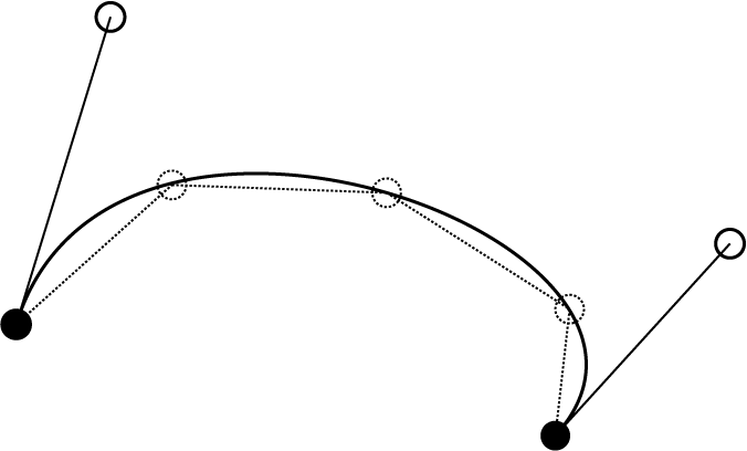
A cubic Bézier curve
I have also shown three points generated by applying de Casteljau’s algorithm in three places, and an approximation of the curve generated by joining the de Casteljau points with straight lines - in a sense, doing something similar to what the Linotron 202 did with the outlines of its font data.
Bézier curves were found to give the designer of curves - such as those used for Renault’s car bodies - an easy and intuitive way to express the shapes they wanted. By dragging around control points, designers can “sculpt” a curve. The cubic Bézier curve, with its start and end point and two off-curve control points, was adopted into PostScript as a command for graphics drawing, and from there, it made its way into the design of digital fonts.
PostScript Fonts, TrueType and OpenType
PostScript level 1 defined two kinds of fonts: Type 1 and Type 3. PostScript Type 3 fonts were also allowed to use the full capabilities of the PostScript language. Prior to this level, fonts could only be specified in terms of graphics instructions: draw a line, draw a curve, and so on. But PostScript is a fully-featured programming language. When we talk about a “PostScript printer”, what we mean is a printer which contains a little computer which can “execute” the documents they are sent, because these documents are actually computer programs written in the PostScript language. (The little computers inside the printers tended not to be very powerful, and one common prank for bored university students would be to send the printers ridiculously complicated programs which drew pretty graphics but tied them up with computations for hours.)
Not many font designers saw the potential of using the programming capabilities of PostScript in their fonts, but one famous example which did was Erik van Blokland and Just van Rossum’s FF Beowolf. Instead of using the PostScript lineto and curveto drawing commands to make curves and lines, Erik and Just wrote their own command called freakto, which used a random number generator to distort the positions of the points. Every time the font was called upon to draw a character, the random number generator was called, and a new design was generated - deconstructing the concept of a typeface, in which normally every character is reproduced identically.
While (perhaps thankfully) the concept of fully programmable fonts did not catch on, the idea that the font itself can include instructions about how it should appear in various contexts, the so-called “smartfont”, became an important idea in subsequent developments in digital typography formats - notable Apple’s Advanced Typography and OpenType.
Type 3 fonts were open to everyone - Adobe published the specification for how to generate Type 3 fonts, allowing anyone to make their own fonts with the help of font editing tools such as Altsys’ Fontographer. But while they allowed for the expressiveness of the PostScript language, Type 3 fonts lacked one very important aspect - hinting - meaning they did not rasterize well at small sizes. If you wanted a professional quality Type 1 font, you had to buy it from Adobe, and they kept the specification for creating Type 1 fonts to themselves. Adobe commissioned type designs from well-known designers and gained a lucrative monopoly on high-quality digital fonts, which could only be printed on printers with Adobe PostScript interpreters.
By this time, Apple and Microsoft had attempted various partnerships with Adobe, but were locked out of development - Adobe jealously guarded its PostScript Type 1 crown jewels. In 1987, they decided to counter-attack, and work together to develop a scalable font format designed to be rasterized and displayed on the computer, with the rasterizer built into the operating system. In 1989, Apple sold all its shares in Adobe, and publicly announced the TrueType format at the Seybold Desktop Publishing Conference in San Francisco. The font wars had begun.11
This was one of the factors which caused Adobe to break its own monopoly position in 1990. They announced a piece of software called “Adobe Type Manager”, which rendered Type 1 fonts on the computer instead of the printer. (It had not been written at the time of announcement, but this was intended as a defensive move to keep people loyal to the PostScript font format.) The arrival of Adobe Type Manager had two huge implications: first, by rendering the fonts on the computer, the user could now see the font output before printing it. Second, now PostScript fonts could be printed on any printer, including those with (cheaper) Printer Command Language interpreters rather than the more expensive PostScript printers. These two factors - “What You See Is What You Get” fonts printable on cheap printers - led to the “desktop publishing” revolution. At the same time, they also published the specifications for Type 1 fonts, making high quality typesetting and high quality type design available to all.
From TrueType to OpenType
But it was to no avail. There were many reasons why TrueType ended up winning the font wars. Some of these were economic in nature: the growing personal computer market meant that Microsoft and Apple had tremendous influence and power while Adobe remained targeting the high-end market. But some were technical: while PostScript fonts never really advanced beyond their initial capabilities, TrueType was constantly being developed and extended.
Apple extended TrueType, first as “TrueType GX” (to support their “QuickDraw GX” typography software released in 1995) and then as Apple Advanced Typography (AAT) in 1999. TrueType GX and AAT brought a number of enhancements to TrueType: ligatures which could be turned on and off by the user, complex contextual substitutions, alternate glyphs, and font variations (which we will look at in the next section). AAT never hit the big time; it lives on as a kind of typographic parallel universe in a number of OS X fonts (the open source font shaping engine Harfbuzz recently gained support for AAT). Its font variation support was later to be adopted as part of OpenType variable fonts, but the rest of its extensions were to be eclipsed by another development on top of TrueType: OpenType.
In 1997, Microsoft and Adobe made peace. They worked to develop their own set of enhancements to TrueType, which they called TrueType Open (Microsoft’s software strategy throughout the 1990s was to develop software which implemented a public standard and extend it with their own feature enhancements, marginalizing users of the original standard. TrueType Open was arguably another instance of this…); the renderer for TrueType Open, Uniscribe, was added to the Windows operating system in 1999.
Later called OpenType, the development of this new technology was led by David Lemon of Adobe and Bill Hill of Microsoft,12 and had the design goal of interoperability between TrueType fonts and Adobe Type 1 PostScript fonts. In other words, as well as being an updated version of TrueType to allow extended typographic refinements, OpenType was essentially a merger of two very different font technologies: TrueType and PostScript Type 1. As well as being backwardly compatible with TrueType, it allowed PostScript Type 1 fonts to be wrapped up in a TrueType-like wrapper - one font format, containing two distinct systems.
OpenType is now the de facto standard and best in class digital font format, and particularly in terms of its support for the kind of things we will need to do to implement global scripts and non-Roman typography, and so that’s what we’ll major on in the rest of this book.
Multiple Masters and Variable fonts
In 1540, François Guyot released the first typeface family - his Double Pica included two alphabets, one upright Roman and one italic. Around four hundred years later, the concept of a “related bold” was added to the typeface family idea.13 Users of type now expect to be able to select roman, bold, italic, and bold italic forms of Latin fonts, but more to the point, Latin script users now use both speed (italic) and weight to create typographic differentiation and establish hierarchy. Not long after, in 1957, Adrian Frutiger’s Univers was designed based on a typographic system of nine weights, five widths, and a choice of regular and oblique - a potential 90-member family, although in practice far fewer cuts of Univers were actually designed.
But what if nine weights is not enough? More realistically, what if the designer has only provided a regular and a related bold, and you need something in the middle? The one development Adobe attempted to make to their Type 1 PostScript font format in 1991 was the idea of multiple masters which aimed to solve this problem: the font would contain two or more sets of outlines, and the user could “blend” their own font from some proportion of the two. They could mix 3 parts the regular weight to 1 part bold weight to create a sort of hemi-semi-bold.
Adobe Myriad MM, with width (left to right) and weight (top to bottom) masters
It was a great idea; the designers were excited; technologically, it was a triumph. Adobe worked hard to promote the technology, redesigning old families as MM fonts. But it turned out to be way ahead of its time. For one thing, very few applications provided support for accessing the masters and generating the intermediate fonts (called “instances”). For another, handling the instances was a mess. “Users were forced to generate instances for each variation of a font they wanted to try, resulting in a hard drive littered with font files bearing such arcane names as MinioMM_578 BD 465 CN 11 OP.”14
Adobe Multiple Master Fonts, as a technology, ended up dying a quiet death. But the concept of designing fonts based on multiple masters (originally borrowed from the Ikarus system) became an established tool of digital type design. Instead of allowing the user the flexibility to create whatever instance combination they wanted, type designers would create multiple masters in their design - say, a regular and a black - and release a family by using interpolation to generate the semibold and bold family members.
Another attempt at the dream of infinitely tweakable in-between fonts came from Apple, as part of their GX font program. As we mentioned above, Apple’s extensions to TrueType included the ability to create instances of fonts based on variations of multiple masters. But the same thing happened again: while it was typographically exciting, application support never came through, as supporting the format would require extensive software rewrites. But this time, there would be a longer lasting impact; as we will see in the section on OpenType Font Variations, the way that GX fonts implemented these variations has been brought into in the OpenType standard.
OpenType finally adopted variable fonts in 2016. We’re still waiting to see how applications will support the technology, but this time the success of variable fonts doesn’t depend on application support. There is another, more important factor behind the rise of variable fonts: bandwidth. With fonts increasingly being hosted on the web, variable font technology means that a regular and a bold can be served in a single transaction - a web site can use multiple fonts for only slightly more bytes, and only a few more milliseconds, than a single font.
-
Pan Jixing, 2001. A History of Moveable Type Printing in China. Beijing: Institute for History of Science, Academy of Science, 273. ↩
-
Hye Ok Park, 2014. “The History of Pre-Gutenberg Woodblock and Movable Type Printing in Korea”, International Journal of Humanities and Social Science, 4:9. ↩
-
See Karow, 2013, Digital Typography and Artifical Intelligence, Dutch Type Library, for the history. ↩
-
Knuth, 1982, “The Concept of a Meta-Font”, Visible Language 17. ↩
-
Fiona Ross, 1988, The Evolution of the Printed Bengali Character from 1778 to 1978, PhD Thesis, School of Oriental and African Studies. Joe Condon, Brian Kernighan and Ken Thompson’s Bell Labs Technical Memorandum Experience with the Mergenthaler Linotron 202 Phototypesetter, or, How We Spent Our Summer Vacation is a fascinating technical look at the insides of the 202. ↩
-
Brian Reid, 1985, “PostScript and Interpress: a comparison”. ↩
-
Look, I’m having to simplify here. METAFONT84 used cubic Bézier curves just like PostScript does, but with the off-curve control points being implicit and automatically generated using John Hobby’s algorithm, rather than explicitly specified as in the PostScript case. I don’t know how METAFONT79 worked. ↩
-
The Font Wars by James Shimada, is an excellent historical overview of those days. ↩
-
When Microsoft were working on TrueType Open before the tie-up with Adobe, the technical development was led by Eliyezer Kohen and Dean Ballard. ↩
-
Tracy, Walter, 1986, Letters of Credit, pp. 65–6. ↩
-
Tamy Riggs, 2014, “The Adobe Originals Silver Anniversary Story”. ↩